– Portraits –
– Three Images –
– [Self, Stranger, Familiar] –
– Self Portraits; –
Pablo Picasso had a particular interest in the self-portrait as well as other things. This interest was the physical image of a man becoming invested with the subjective projection of the artist. Throughout his career, he painted different portraits of himself, in different ways. For example, in this picture, he is supposed to be around twenty years old. However, he looks in his late thirties and looks ill and gaunt. He portrays himself as old and tired, the blue tones suggest he is struggling with some kind of sadness, as this is what blue usually represents.
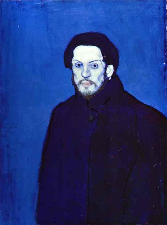
Pablo decided to portray himself like this, it just goes to show if you take the picture yourself you can manipulate it to however you want. You decide what mask you want to wear or not wear. You decide whether, to tell the truth, or not and today with so many social media and editing platforms, we choose to lie about ourselves and our lives.
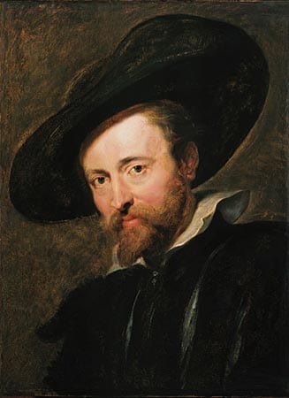
Peter Paul Rubens also did a self-portrait. Rubens specialised in prolific artistry. In his self-portrait, the tones are warm and he looks confident and happy. The complete opposite of Picasso self-portrait.
People taking ‘selfies’ of themselves has been around for many, many years. If we do not capture what we look like, we worry we may fade into nothing, and no one will remember us. We rely on photos to tell us what we used to look like, or we need them to remind us of the people who have passed.
– Stranger Portraits; –
On this website, I found a photographer named Danny Santos II. He has done a portfolio on ‘Shooting Strangers’ – although it sounds a little sinister, it is very innocent. When we goes out on the streets, he see’s people that stand out in the crowd. He has produced some really engaging work.
One thing he does very cleverly is, he never asks for their names or where they come from. He says he wants the audience to see them how he saw them in the first place.
Although in some he says ‘Don’t be fooled by his intimidating look. As soon as I took this photo he was clowning about’ surely this is bending the truth as to what his personality is like?
Here are a few interesting images from his work;
The lighting in this image is very complementary, almost like it is done in a studio. The only thing is her right eye is not fully in focus.
This image is beautifully lit as well, natural lighting is a huge compliment. You can see everything in his eyes, you can see the photographer stood afar from the stranger.
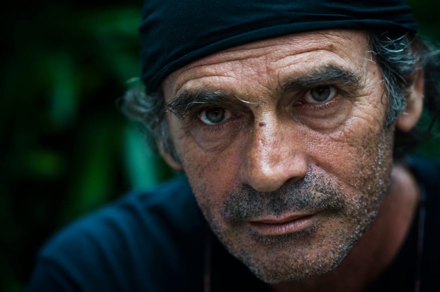
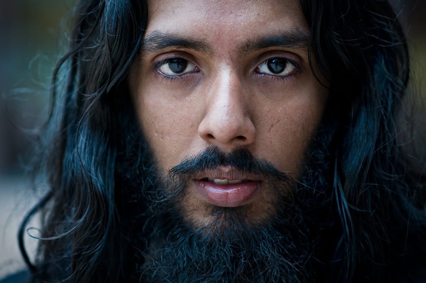
This image is darker, indicating he is a bit scarier – or it was just a dull day.
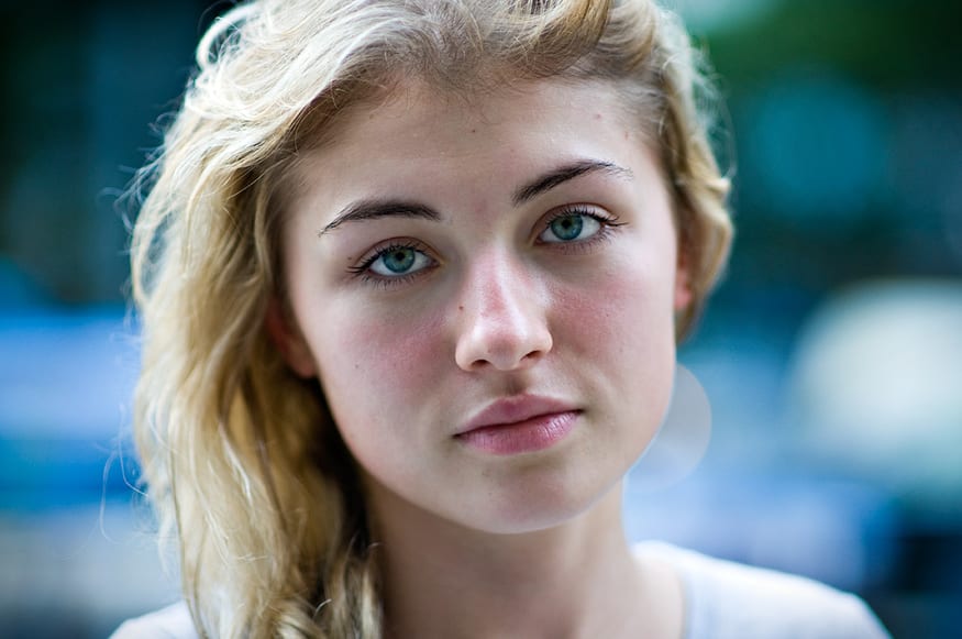
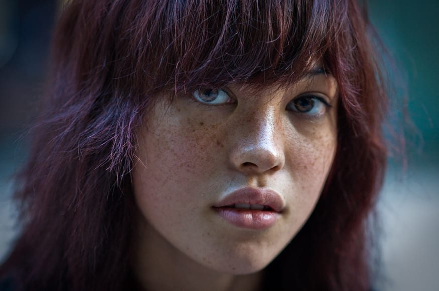
This image is very white/blue it could mean she is innocent/sad. It is again beautifully lit – however, the background is a little bit distracting and there does not feel like a lot of depth between the background and her.
– Family Portraits –
Nick Waplington – Between 1988 – 1991 – Claxton Projects;
“It is in this context that British photographer Nick Waplington spent four years documenting the daily lives of two working-class families on a council estate in Nottingham, England. Rather than embracing the contemporary photographic conventions of social realism, Waplington chronicled the lives of these families in saturated color, capturing an intimate narrative with poignancy and an unexpected humour.
We are thrust into the raw mechanisms of the family unit, exposing the viewer to every intimate moment of domesticity and laying bare the private sanctity of home. Although chaotic visits to local stores and expectant encounters with ice cream vans are all documented, it is in the living room of the title that provides the theatrical backdrop to most of the daily disorder.”
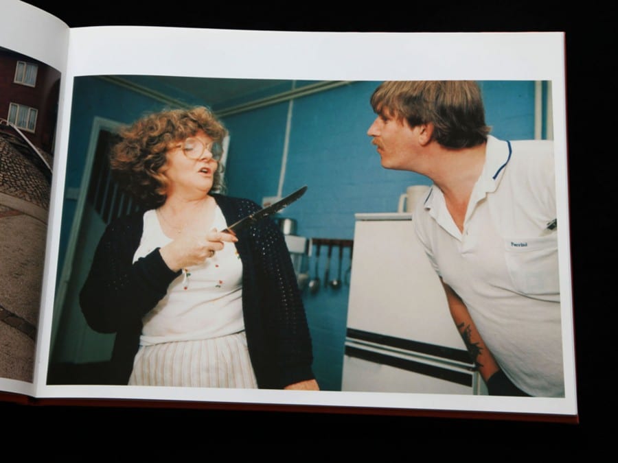 Typical couple dispute.
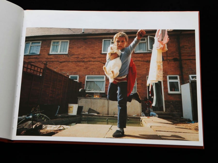 Typical kids playing.
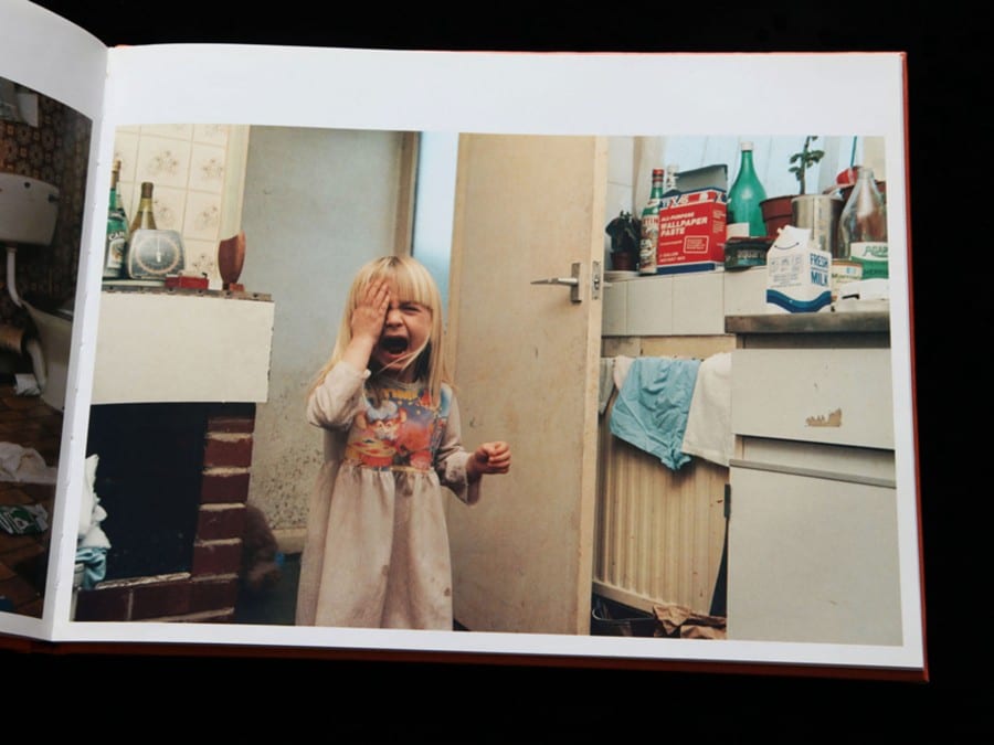 Typical tantrum.
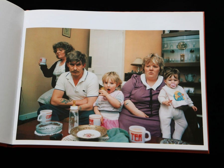 Typical TV time.
Nick spent years documenting two families. I love this idea. In the media, we all censored to the idea of how and what the perfect family is and should be. Upper class, a family of four, nice house, good schools etc. However, this is not the case. I come from a family of six, and it is not all perfect.
http://www.claxtonprojects.com/books/nick-waplington/
– Stranger –
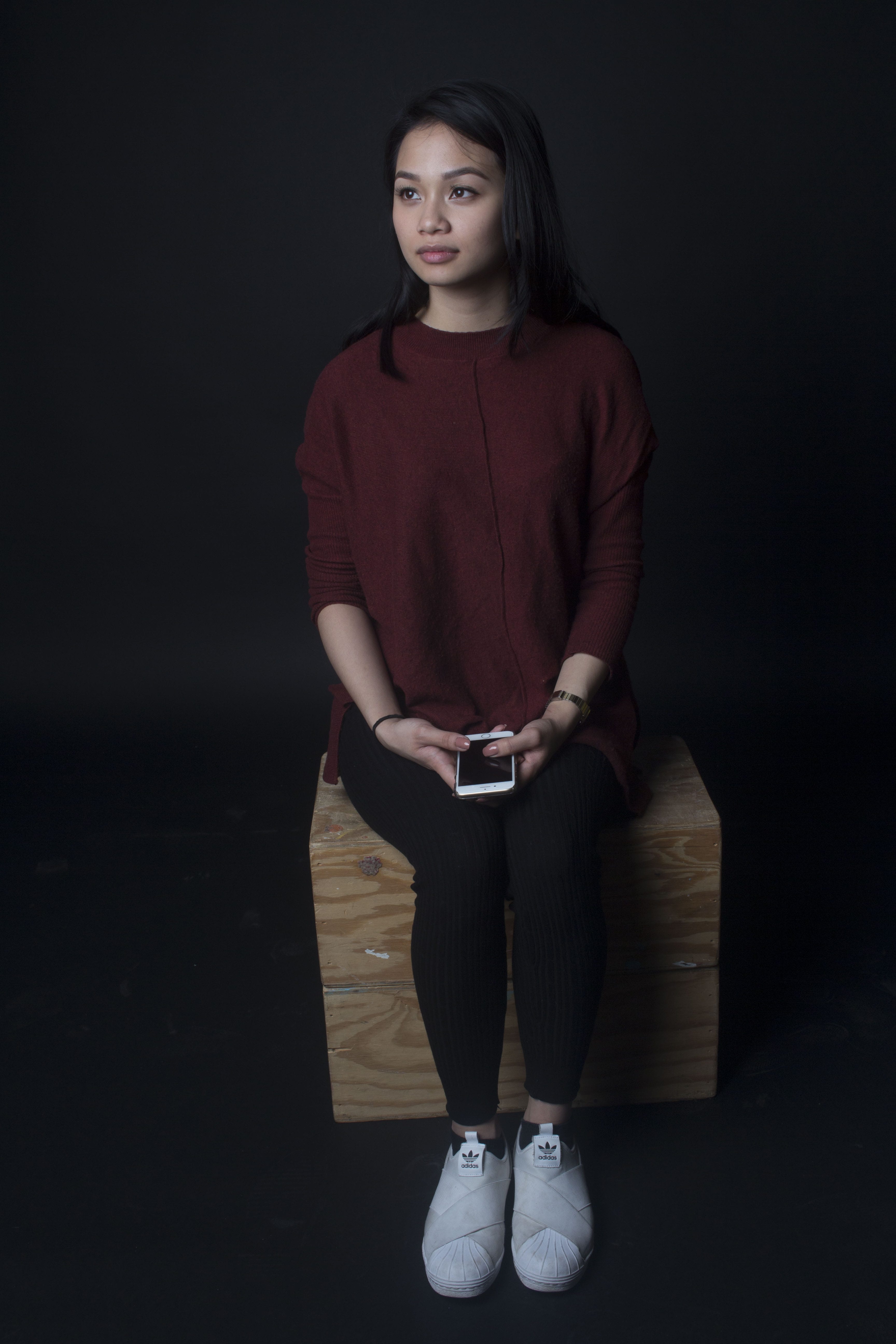
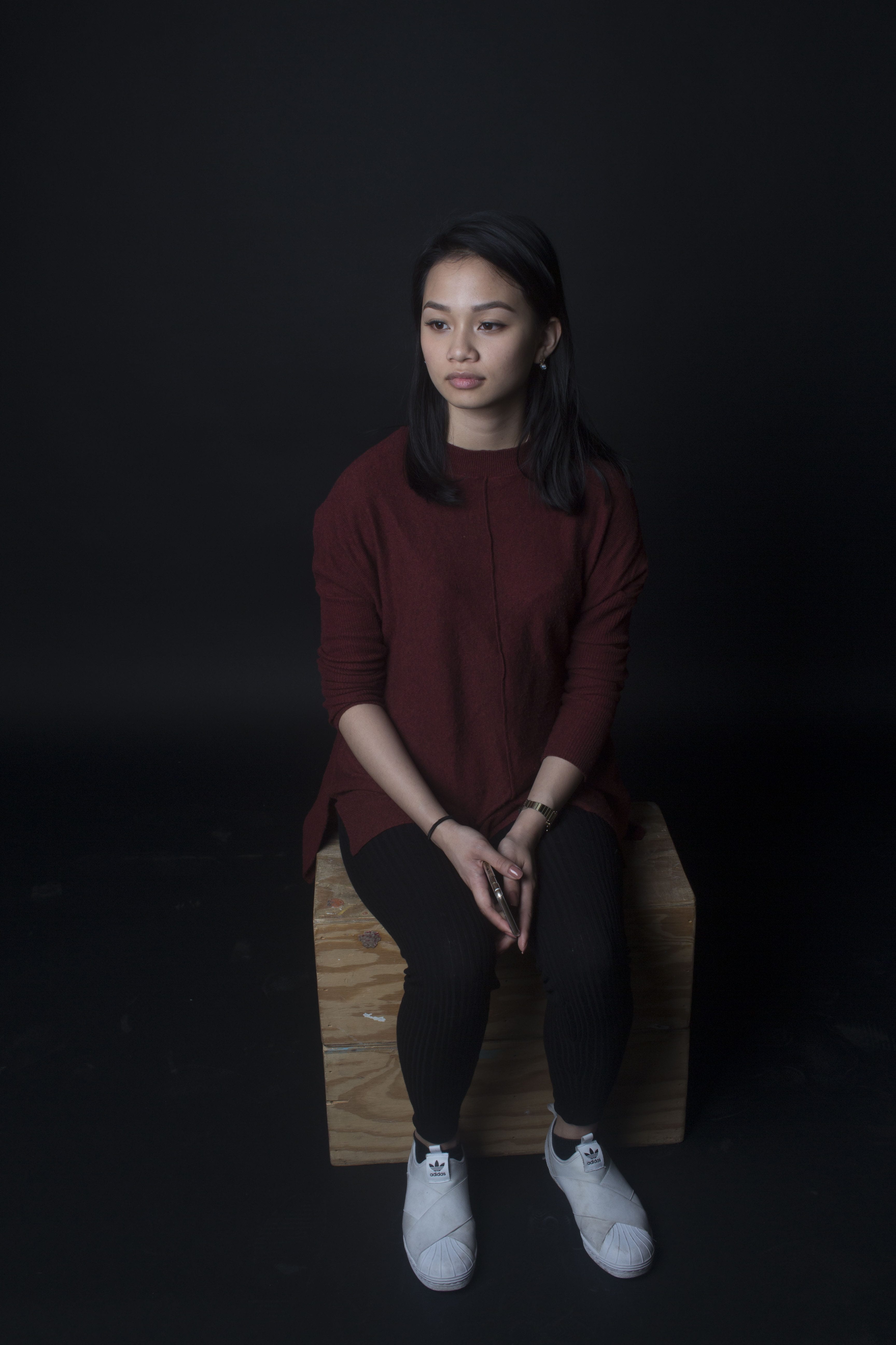
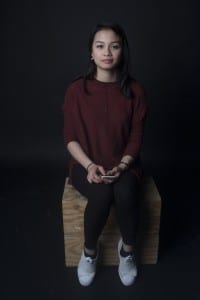
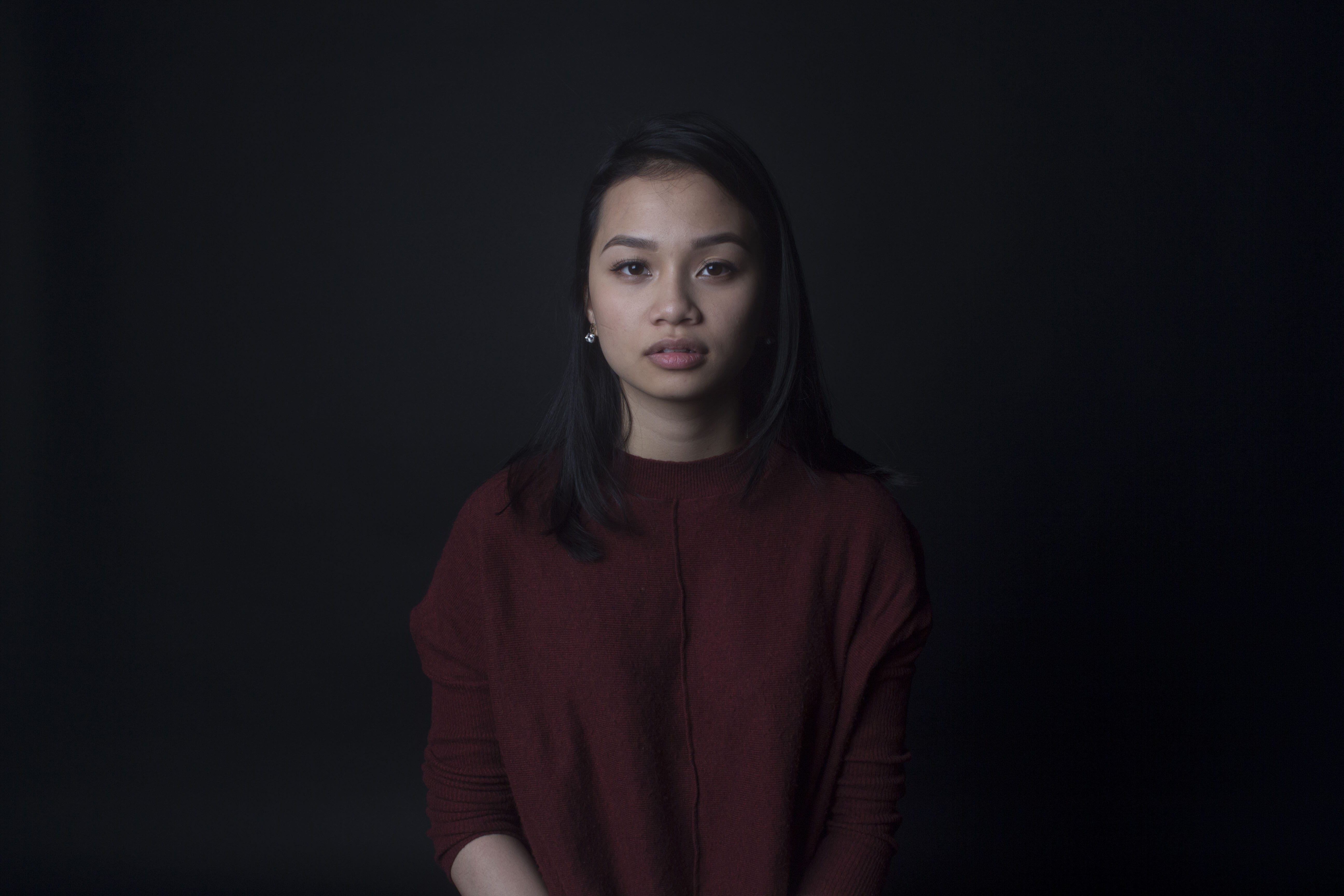
For my stranger portrait, I ran into a girl names Kriselah. She was so lovely and upbeat, I asked if she could come to the studio to be part of my project and she was over the moon that I asked. She was very comfortable in front of the camera and was very compliant.
Unlike Danny Santos II, I did not want to make them not smile because that is not what most people are like. Kriselah is very bubbly and I wanted to show that to the viewer. I went with the black backdrop because it is more pleasing than the others. The lighting is split deliberately because although she comes across like a lovely person, I do not know her and the audience do not know her. She is still a stranger and this lighting speaks that.
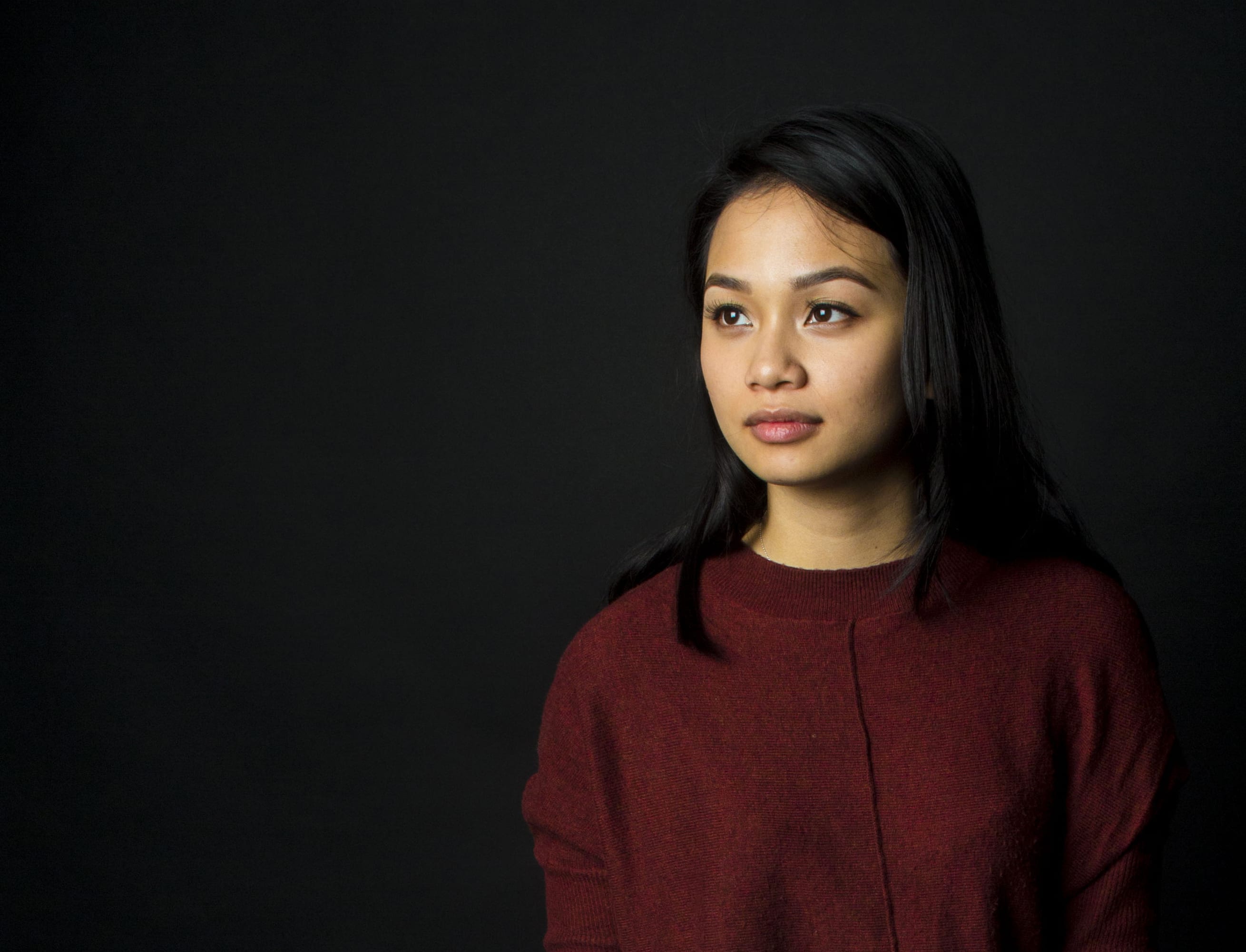
– Here are the test shots –
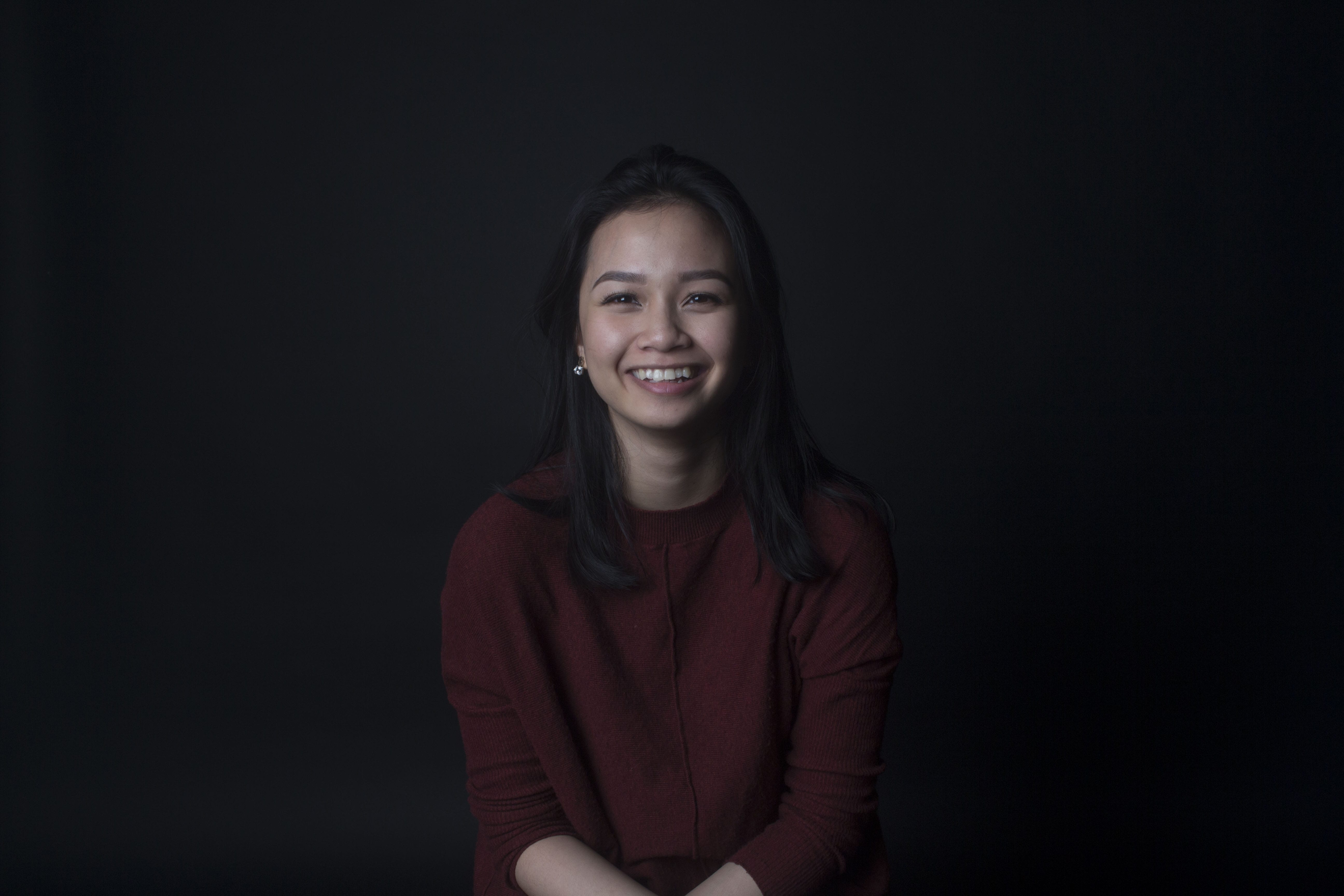
To me the first one, second from last and the last one are my favourite pictures, it really compliments this strangers personality. It makes her look like a bit of a dreamer, from the conversations we had she seemed like such a genuine, kind dreamer. Therefore, I am going to choose this image as my final image.
I ended up choosing image number 1 – 7. I could not decide which one would be better. I edited the images to make them look a little more pleasing aId I experimented with the cropping tool and here are the results.
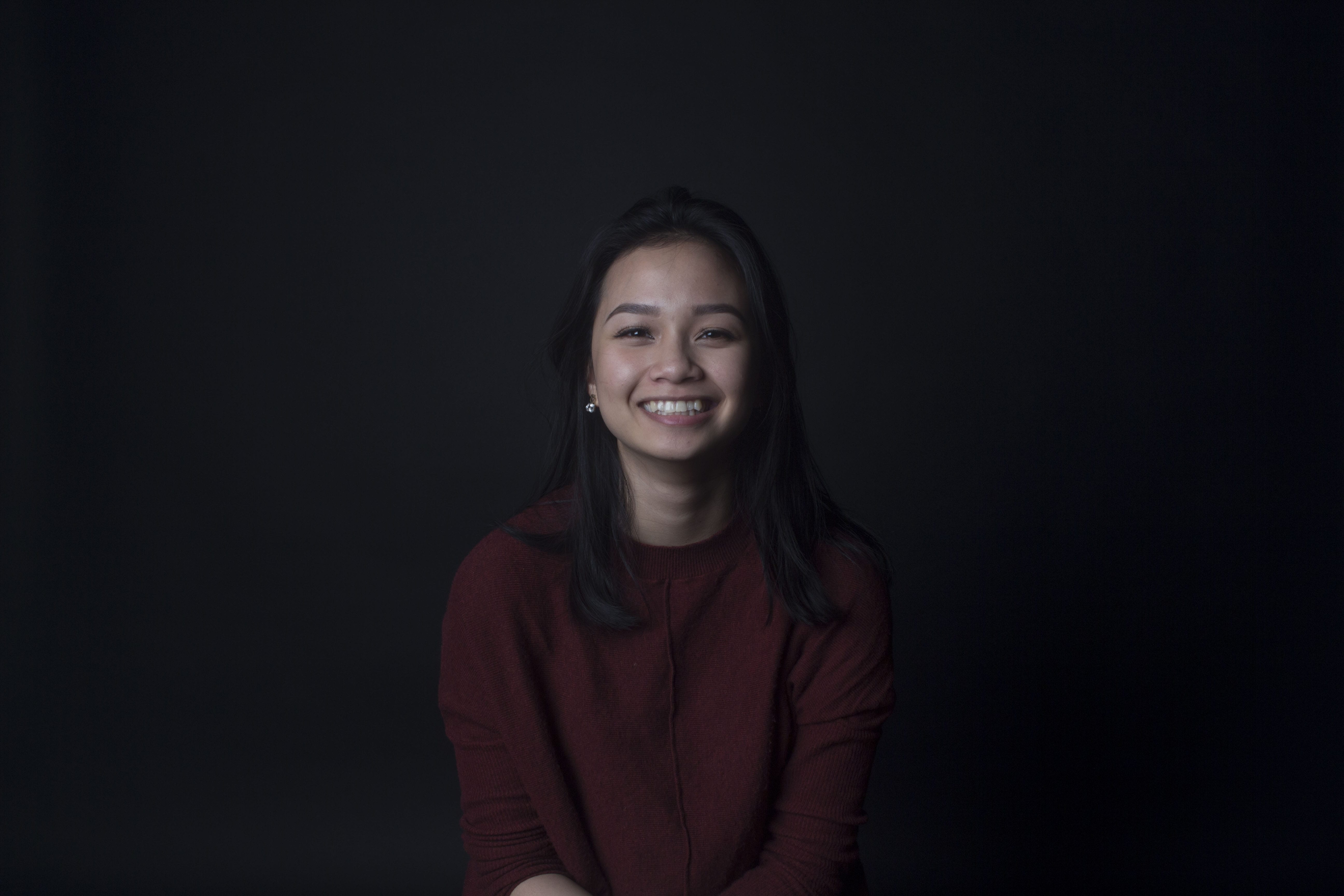
 This image fits all the descriptions above, but for some reason, I am not fully satisfied.
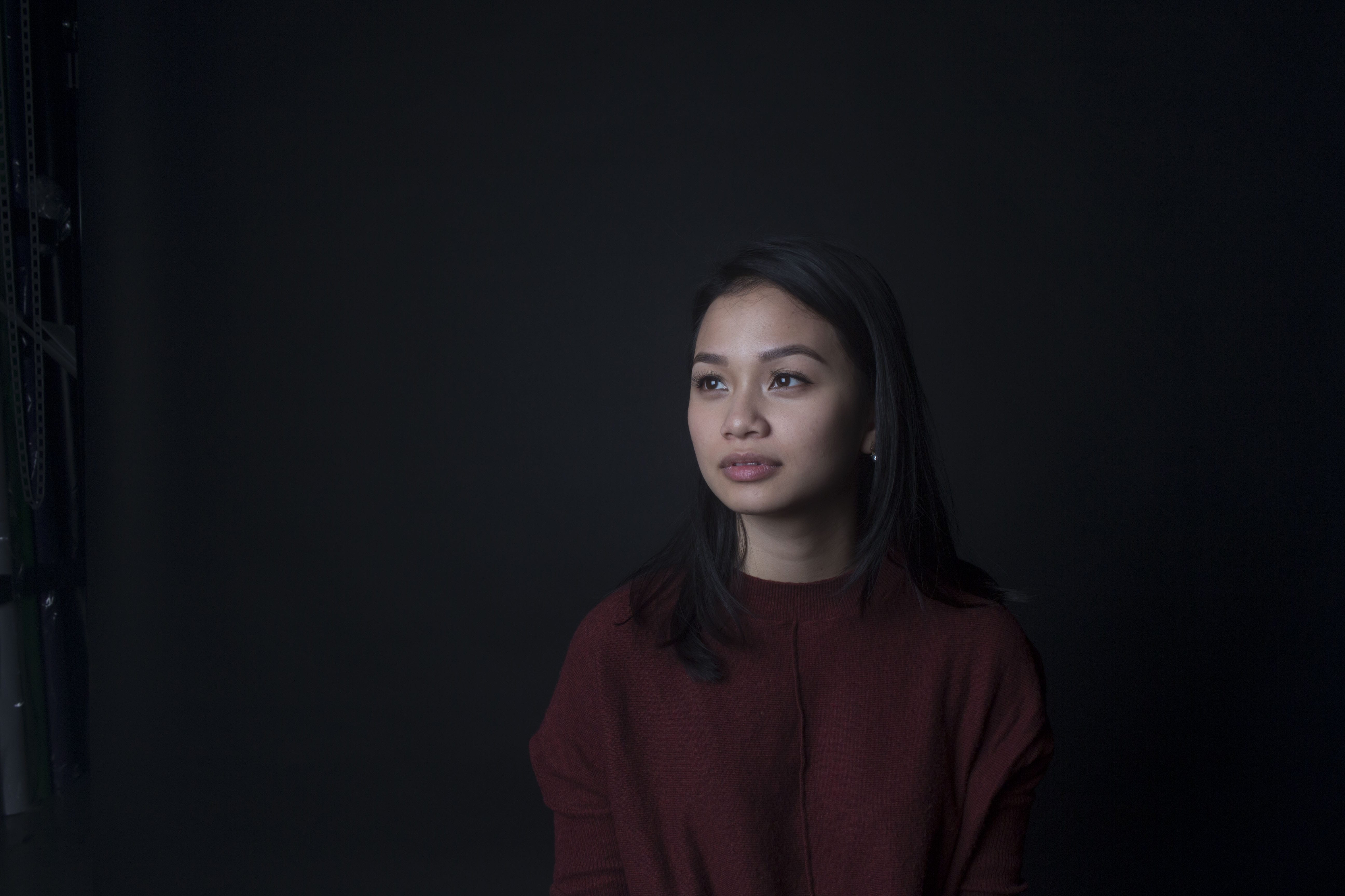
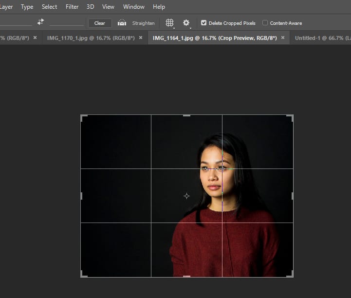
I was particular with this image (as shown below) I lined the grid up with her eyes so I would get the right amount of head space and it could be perfect.
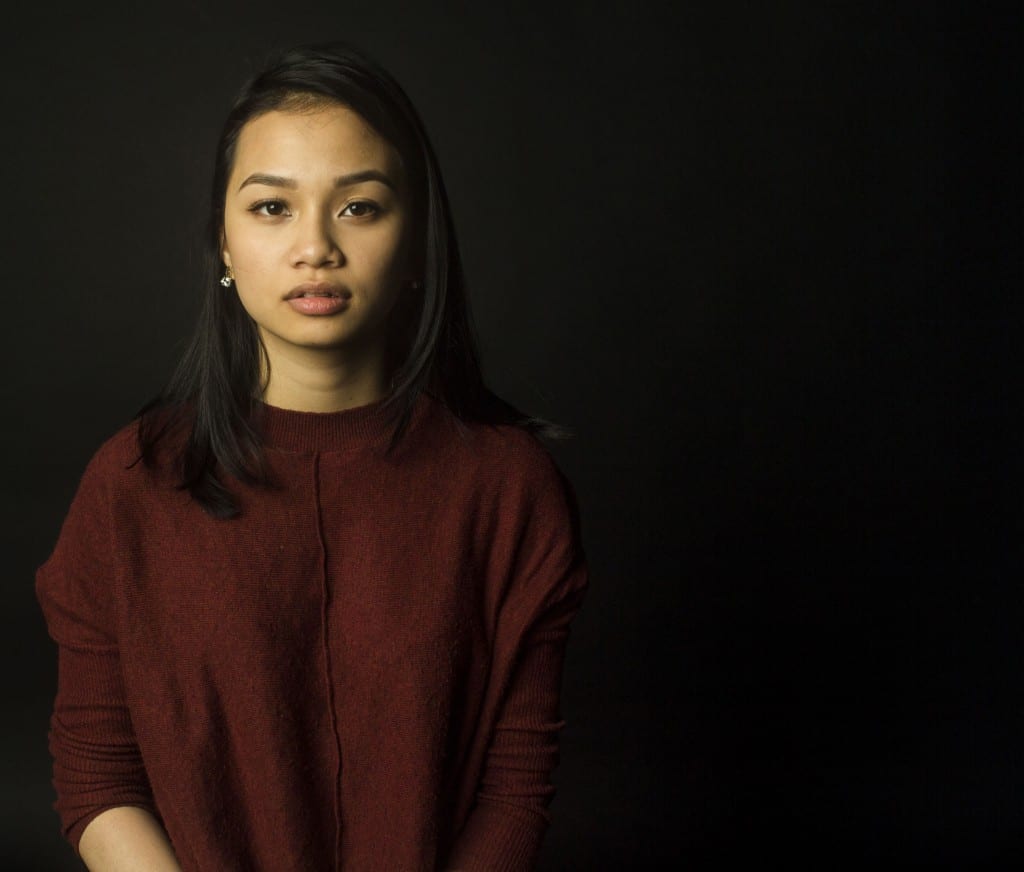
With the crop tool I only cropped one-half of the picture, I felt it would be work rather well and it is strangely pleasing. It goes against the rules of symmetry but I think it still looks okay, it could mean there is another personality in her that I did not see, hence the shadowed and the darker side of her face and body. It is good to break rules in photography sometimes. As my favourite, I choose this to be my final image. I edited the image to appear a bit warmer than it is meant to. I did this too compliment her personality as such. She seemed like a sweet, caring girl and hopefully, the colour makes this appear. There is a slight shadow on her face, this is because she is a stranger and there may be a side of her that I did not see, and so it makes her open to interpretation.
– Familiar –
I took a picture of my partner (Adam), whom I love dearly. I decided to go for a different style to the stranger pictures, as my stranger was photographed in a studio I decided to take a picture of him in an open place, with lots of light. This style is quite similar to Danny Santos II, he takes pictures of people out in the open and it makes for a more natural portrait.
Here are some test shots I did of Adam;
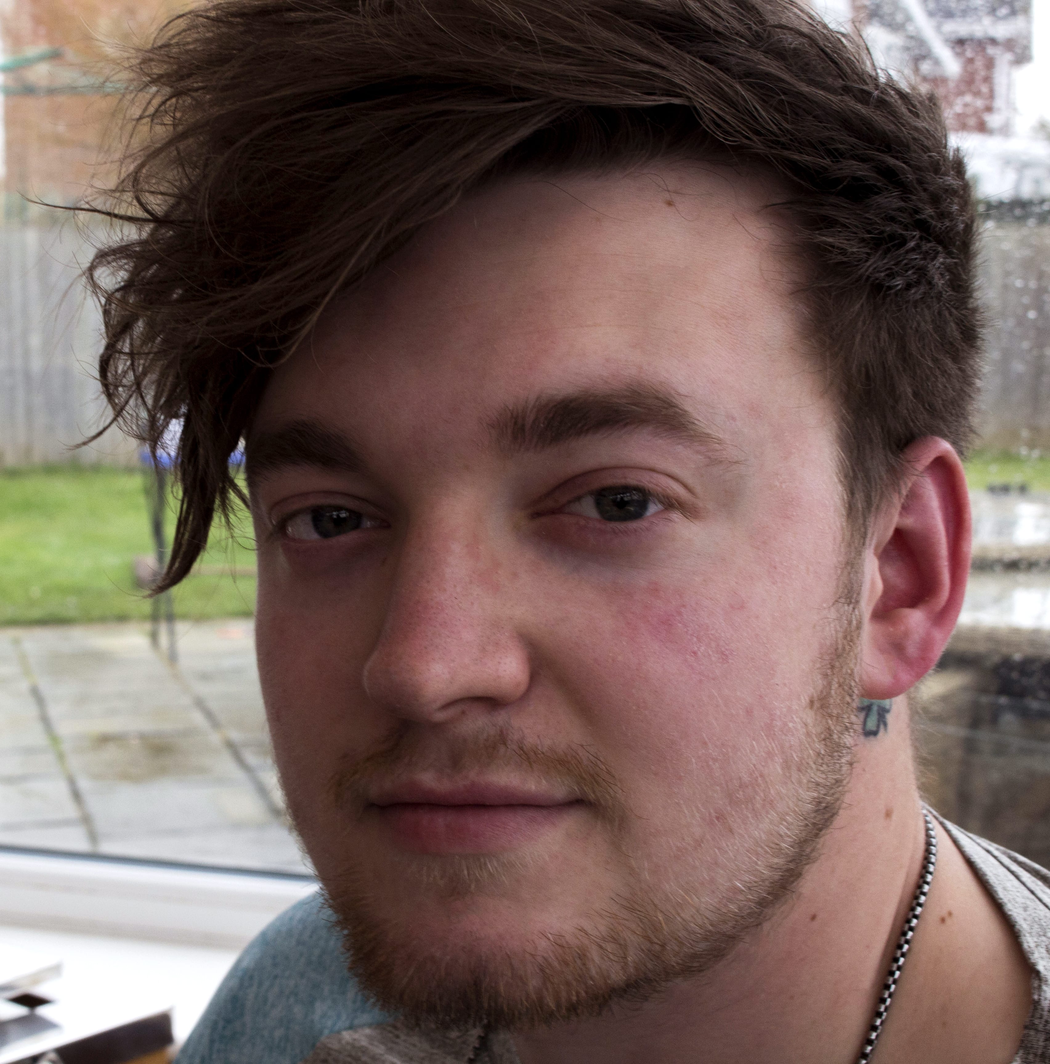
This image is my favourite, he looks so innocent.
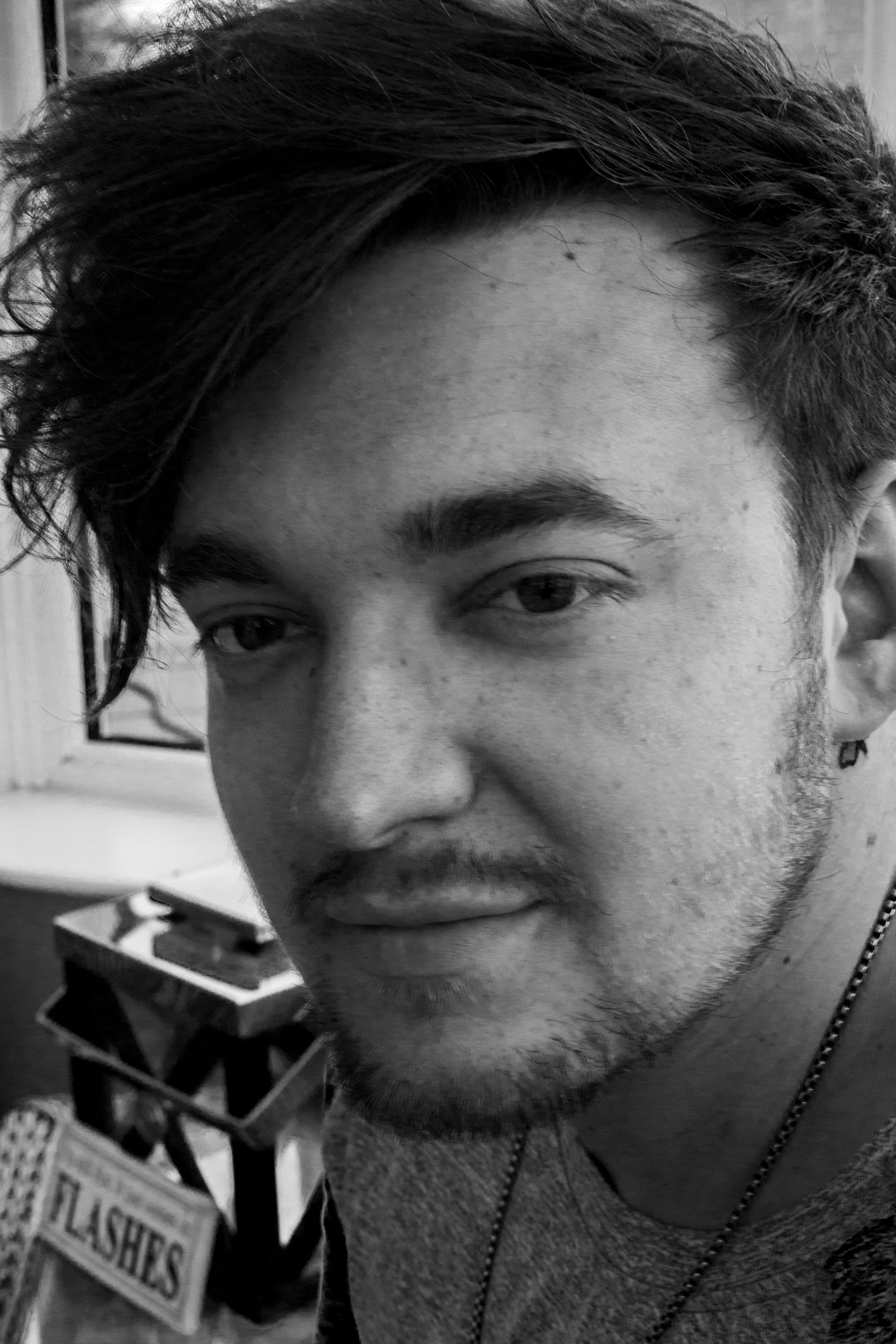
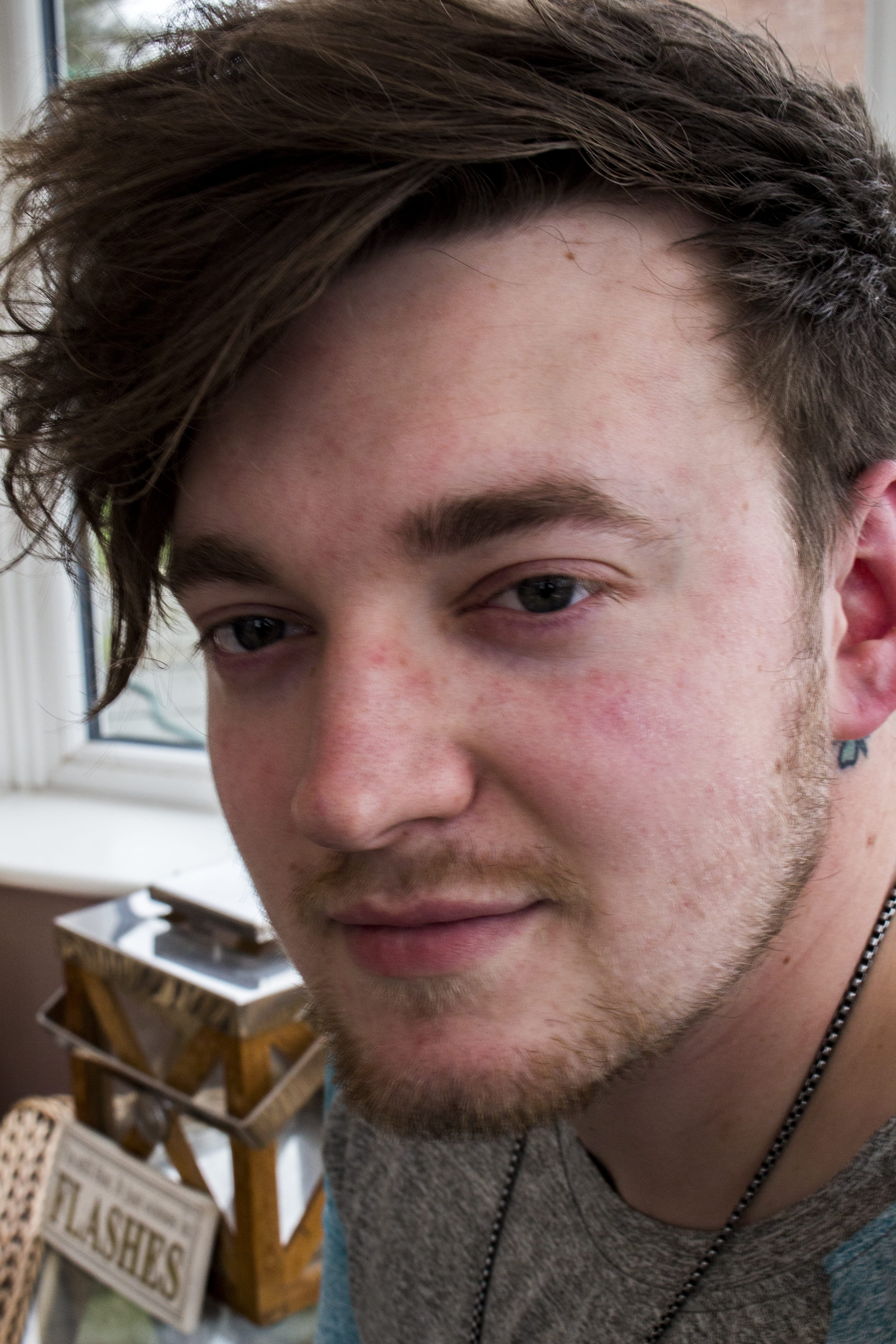
I tried to compare the two images using black and white and a colourful contrast, I do not like the black and white I feel it distracts from the detail and is not as flattering. The second picture is colourful and vibrant and sticks out more.
– Self Portrait –
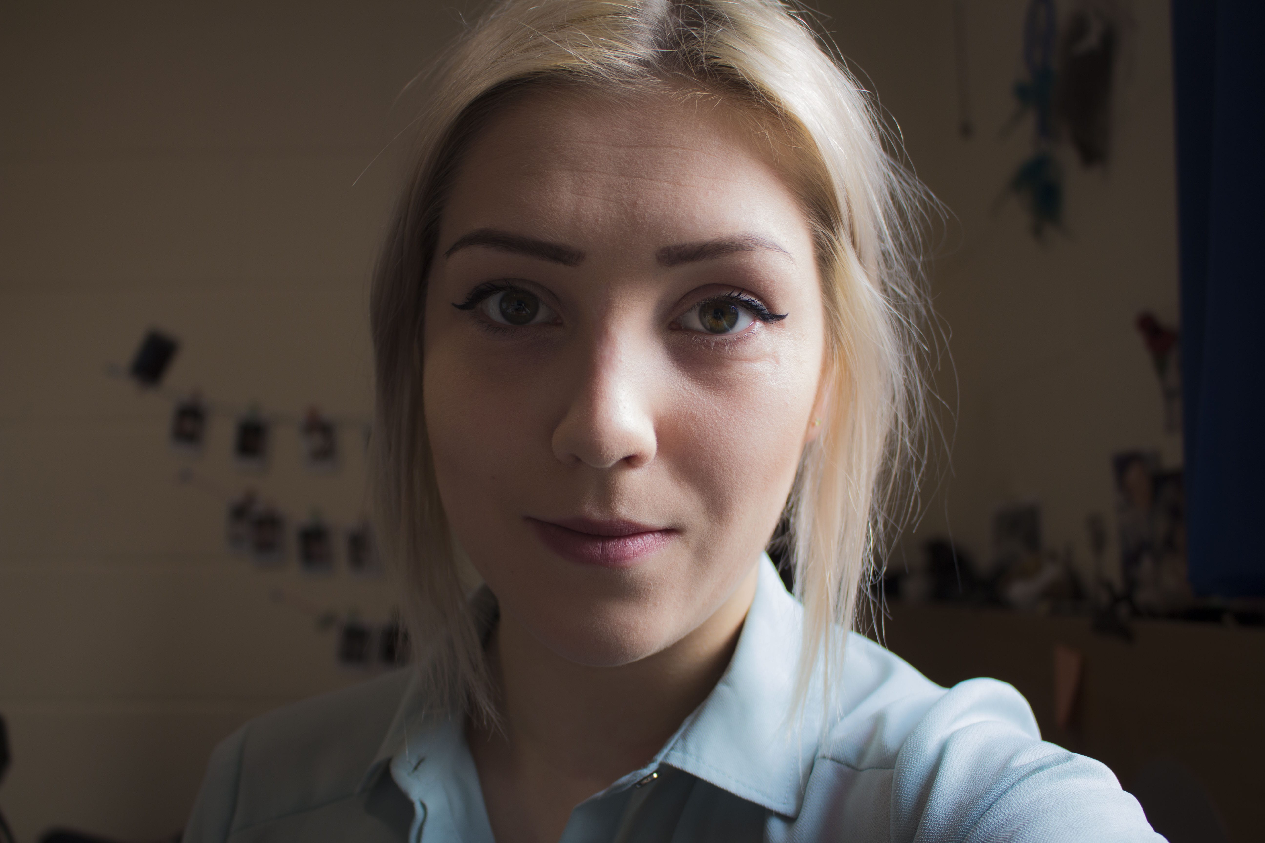
Typically, when taking a picture of myself I will avoid the left side of my face due to the scars on my nose, under my eye and on my neck.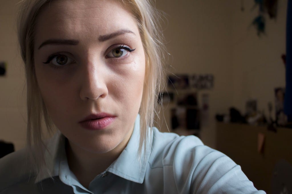
In terms of focus, this is the most in focus picture out of the three. I am not really a fan of this picture but it is technically pleasing and I am going to use it as my final image.
I hate this image because I am fake smiling. It does not look real or feel real, I do not think it reflects me at all.
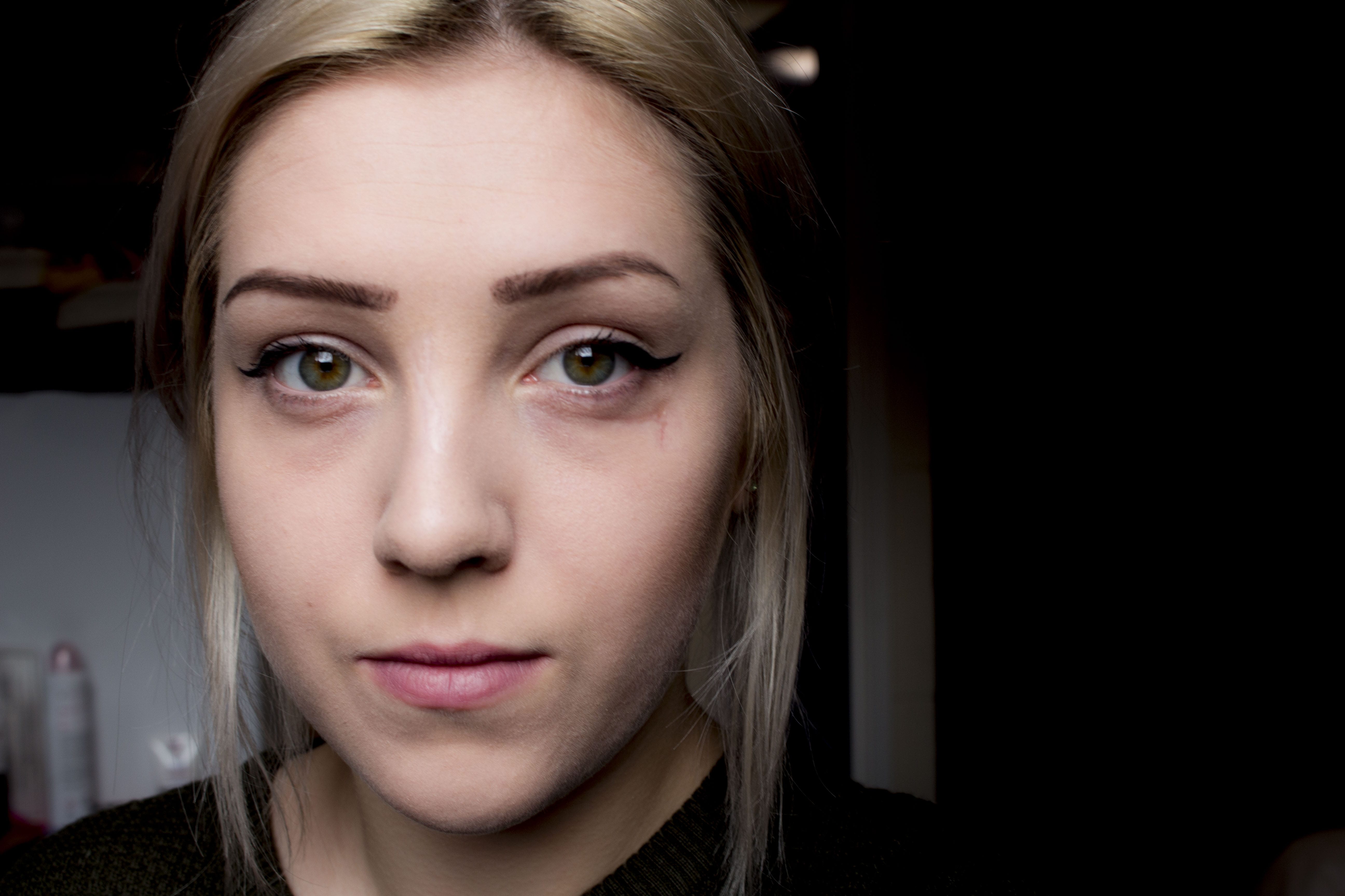
I really like this image, however, it is really out of focus. When you zoom in, the eyes are not in focus. However, I really like the composition and it shows my scars which is what I wanted to reveal in the first place. It is a shame I did not correct the focus in this particular images. The colours go really well together.
Leave a comment